Findity is an expense management platform that automates and simplifies the everyday lives of their clients, partners, and their customers

Challenge
In actuality, Findity was not a single company, but two: a ‘white label’ expense software provider for businesses to incorporate into their own expense management solutions under the Findity name, and also a standalone package sold through a brand called Companyexpense. Having dual brands in the marketplace was an impediment to their goals of global expansion, and they were looking to integrate both into one unified brand.
Approach
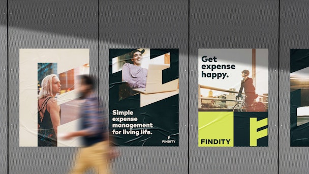
After a series of workshops with Findity’s leadership, we unified the brand under the Findity name and refined a coherent messaging strategy that reflected their new position: inspirational, knowledgeable, understanding, and most importantly, passionate about eliminating the pain of expense management for everyone. The new logo mark, a stylized F symbol, was inspired by Nordic runes symbolizing wealth, money, and financial strength. The brand depicts a cross-section of life, free of the hindrance of expense management, paired with a modern color palette and no-nonsense, ageless type.
Impact
Findity has gained clarity from the new brand, allowing them to stand out in an otherwise crowded market while better communicating their product benefits to a much wider audience. Developing strategic alignment and creative work hand-in-hand resulted in a coherent central framework that clarified a complex internal debate, allowing Findity to speak with total confidence while ensuring credibility and projecting their warm, knowledgeable personality more broadly.

