Jell-O unveils new logo and packaging for the first time in 10 years
The modernized designs from BrandOpus aim to resonate with older and younger generations alike.

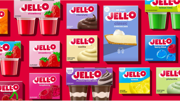
Jell-O's refreshed logo and packaging hit stores this month / Credit: Jell-O
Jell-O has today revealed its first revamped logo and packaging in a decade.
The 178-year-old Kraft Heinz-owned dessert maker says the rebrand ushers in a “new visual identity that positions the brand for relevance today and in the future among a new generation of parents” while still honoring ”the brand’s legacy.”
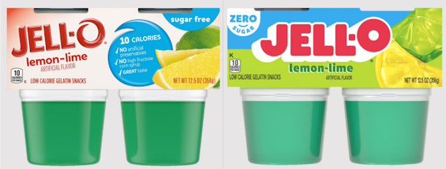
The new design embraces matte block letters shaded with white to give them dimension, its ‘O’ angled slightly upwards. The packaging spotlights that certain products have zero sugar and places impressionist depictions of its fruit flavors on the right side.
By contrast, its retired look displays glossy, narrow lettering with an ‘O’ in a typeface resembling handwriting. The product’s offerings appear as a checklist, while its flavors are depicted literally, with photographs of fruit.
Despite their differences, the red lettering and emphasis on the ‘O’ help keep the brand instantly recognizable.

“As ‘America’s most famous dessert,’ we aim to transcend generations and want to continue bringing our customers on a never-ending flavor journey,” said Kristina Hannant, associate director of desserts at Kraft Heinz. “After 10 years, it was time to take a look at our packaging and bring Jell-O into the future in a bold, playful, wonder-filled way.”
The fresh packaging will hit grocery stores this July and be displayed across Jell-O’s entire product portfolio.
The rebrand was carried out by BrandOpus, whose clients also include Molson Coors, Panera and McCain. Creative director Rebecca Williams said: “With the Jell-O renovation, we’re bringing back the jiggly fun and harnessing the wonder that the brand brings to adults and kids alike. Working with the team at Kraft Heinz, we’ve loved taking on the task of reimagining and reinvigorating the brand for the next generation of parents by creating an imaginative and playful brand world that invites them to see their everyday in inspiringly wonderful ways. We’re excited for the possibilities that the new equities and iconic logo will unlock for the brand to propel it into the future.”
Jell-O’s rebrand marks one of Kraft Heinz’s 18 brands that have launched new brand foundations and pack architectures within the past three years. Earlier examples include Kraft Mac & Cheese, which unveiled a new brand identity in June of 2022, and Shake ‘N Bake, which removed its plastic ‘shaker’ bag last November as the brand’s first step towards sustainability.
Credits:
Chief creative officer: Paul Taylor
Strategist: Amit Kumar
Client director: Alice Waterman
Client manager: Angela Hunter
Creative director: Rebecca Williams
Lead designer: Sarah O’Connor
Production manager: Jennifer Harland
Artworker: Jason Darby & Jeff Russo
Retouching: Myles Dewbrey
Producer: Seona Bell
Copywriting: James Best
3D rendering: Aaron Kaufman

