Robinsons dials up its marketing to stay ‘relevant’ after ending Wimbledon partnership
The Britvic-owned squash’s brand director talks us through its new visual identity and explains its plans to “modernize” the brand as it looks beyond Wimbledon.

Robinson unveils first rebrand in a decade / Robinsons
18 months after Robinson exited its iconic 86-year Wimbledon partnership, the brand has unveiled a fresh new look and a marketing strategy that aims to ensure its heritage doesn’t hold it back.
Robinsons brand director Charlotte White is behind the squash’s first major rebrand in over a decade as it looks to appeal to younger, modern families. “We’ve got to make sure our tradition and heritage – which is so fantastic from a quality perspective – don’t end up holding us back,” she says.
“The risk is you start to blur into a slightly more nostalgic, kind of old fashioned brand. This is about making sure, with the new visual identity, that the brand is bold, modern, clean, more joyful and more vibrant in the way that we show up.”
Robinsons was invented at the tennis tournament back in 1935 as a way to hydrate players, so the decision to break ties after 86 years came as a shock.

Advertisement
White says it was “bold” to exit Wimbledon and launch in its place the Big Fruit Hunt, adding: “I don’t see the decision to move away from Wimbledon as a seismic break with the past, but as us embracing new opportunities.“
The thinking behind the £1.5m interactive virtual fruit hunt was a way to engage younger families and run a summer-long activation. “We all know that summer holidays are a real challenge for parents to keep kids lively and excited,” she adds. The AR experience will return for a second year.
Advertisement
Not content with stepping back from one major sports sponsorship, Robinsons signed up for The Hundred cricket tournament in 2022 and is now in its second year. “The Hundred is a really interesting evolution for the England and Wales Cricket Board and the cricketing world because it has taken the cricket format and turned into something that is much more modern, contemporary and accessible to everyday families.”
White also notes that The Hundred is growing its audience with kids and women: “As a modern contemporary format, it mirrors the ambition that we have for Robinson to ensure the brand stays exciting, relevant and at the heart of modern family life.”

First Robinsons rebrand in a decade
White says the squash category had gotten stuck marketing itself as sugar-free rather than promoting the drink as packed with fruit flavor. “It’s not just a case of livening up water – which is a rational, functional message – but it actually tastes great and that’s why families and kids love Robinsons.”
Suggested newsletters for you
The rebrand, White says, is about “injecting more emotion, more energy, more excitement back,” back into Robinsons.
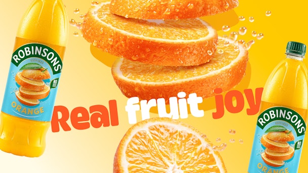
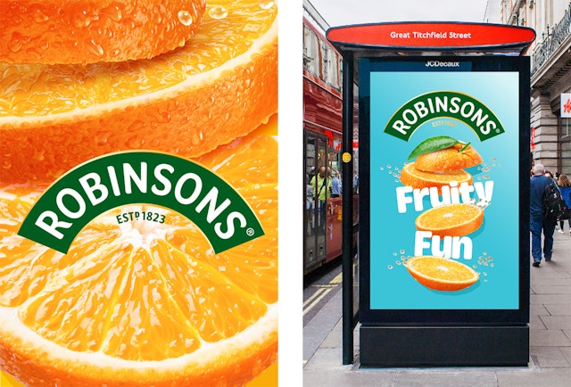
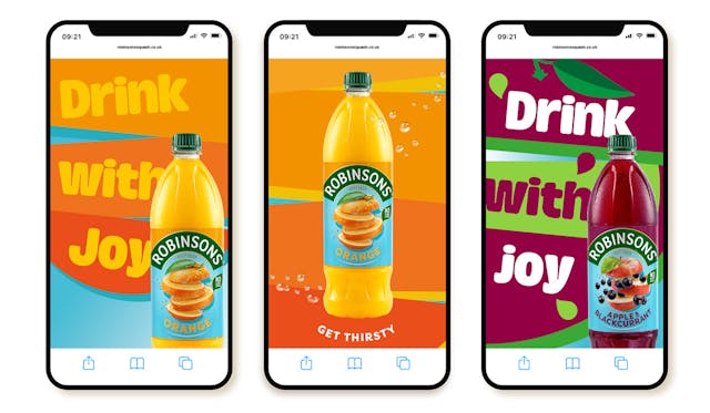
The refreshed packaging design and identity were created with the brand agency Bloom and has already hit the shelves. The bottle label has been stripped back and simplified, the image of fruit bigger and bolder, while the colors have also been brightened.
A full-funnel marketing campaign to support the rebrand has been teed up for the summer to will tie up to the second year of the Big Fruit Hunt.
“We need to assert our leadership in the category and be more confident and dial up the excitement around Robinsons again.”

